Have you ever noticed how a red character immediately feels like a proactive leader, while a blue one feels dependable and calm? We make these judgments in less than a second.
Color has the power to deliver an impression before a single word is ever spoken.
In the world of character design, color is more than just visual flair: it’s a strategic tool that influences the viewer’s emotions and even their motivation to take action. In this post, we’ll explore the vital role of color in character design through the lens of color psychology: the study of how color affects the human mind.
We’ll break down:
- Real-world examples of corporate characters categorized by color.
- Common trends across different industries.
- Practical tips for choosing the perfect palette for your own brand’s character.
Let’s dive in!
The Deep Connection Between Character Design and Color Psychology
Color psychology is a field of study that explores the relationship between the characteristics of color and the human psyche. When we see a color, we instinctively and experientially associate it with a specific image or feeling.
While this applies to many fields beyond just character design, approaching color through the lens of psychology turns color scheme into a way to appeal directly to the viewer’s emotions. By choosing the most suitable colors for your brand, you can communicate a character’s personality and role more effectively without the need for detailed explanations, which ultimately leads to a stronger brand image.
Color Instantly Communicates Personality and Role
A character’s encounter with a user often happens in the blink of an eye, such as when scrolling through social media or seeing an advertisement. In that brief moment, the character needs to convey its personality and role before any explanation is even read.
This is where color psychology truly shines. For example, red is a color associated with passion and energy, making it easy for people to recognize a character as having a cheerful, positive personality. Conversely, blue evokes feelings of security and calm, making it ideal for when you want to leave an impression of reliability.
In essence, color can be thought of as the very first line of communication: it’s what defines a character’s first impression.
The Psychological Positioning of Warm, Cool, and Neutral Tones
Colors can be broadly categorized into three groups: Warm, Cool, and Neutral (achromatic). Let’s break down the characteristics of each.
| Main Colors | Impressions | Applications | |
| Warm | Red, Orange, Yellow | Approachability, Vitality | Children’s content; contexts where friendliness is key. |
| Cool | Blue, Purple | Intelligence, Trust | Indicates formality or sincerity. |
| Neutral | White, Black, Gray | Symbolism, Sophistication | When highlighting the character’s form or narrative depth. |
Warm colors carry a strong, energetic image and are frequently used in contexts that emphasize friendliness or when targeting children. Cool colors convey a sense of integrity, making them suitable for industries where reliability is paramount, such as finance or infrastructure. Neutral colors, which aren’t easily influenced by background colors, are effective when you want to make the character’s actual silhouette or underlying narrative stand out.
There is no correct tone to choose; the key is to work backward from the question, “What do I want the audience to feel the moment they see this?”
Which Colors Are Brands Choosing for Their Characters?
Now, let’s get to the heart of the matter: categorizing existing corporate characters by color to explore trends based on industry and role.
We have broken colors down into six main categories to examine the specific tendencies and character examples for each.
Red: The Classic Protagonist

Co-suke from CO-OP Kyosai. Source: https://coopkyosai.coop/
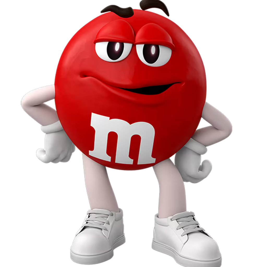
Red M&M. Source: https://www.mms.com/en-us/explore/mms-characters/red
In the world of Japanese sentai (squadron or hero team) shows, red is always the leader. It’s a color that radiates action, passion, and literal heat. Because it conveys such a strong sense of being the main character, it is frequently used for manga protagonists and brand mascots alike. However, because it is such a classic choice, there is a risk of getting lost in a crowded field of competitors.
| Manufacturing | Peko-chan (Fujiya)Yanbo (Yanmar)Pyon-chan (SSP Co., Ltd.)Boukun Habanero (Tohato)UHA-boy (UHA Mikakuto)Punch-man (Punch Industry) |
| Retail & Distribution | Toretate Tomato-kun (U-COOP)Daizo (DAISO) |
| Finance & Insurance | Co-suke (CO-OP Kyosai)Tokkun (Tomato Bank)Momochu (The Chugoku Bank / Chugin App)TIPPY☆彡 (Nihon M&A Center Holdings) |
| Service & Infrastructure | Keikyun (Keikyu Corporation) |
| Software & Communications (IT) | BSD Daemon (FreeBSD) |
| Education & Government | WASEDA BEAR (Waseda University)Chiba-kun (Chiba Prefecture)Kyuta (Tokyo Fire Department) |
Red is often used for characters intended to project power and initiative, or for those designed to communicate specific sensations, like the spiciness or heat of Boukun Habanero. The closer the shade is to a primary red, the more intense the impact, making it a reliable choice for a long-standing face of a brand. That said, since many brands use red, it’s essential to differentiate your character through unique silhouettes and facial expressions to ensure they don’t blend into the crowd.
Blue: Trust and Formality
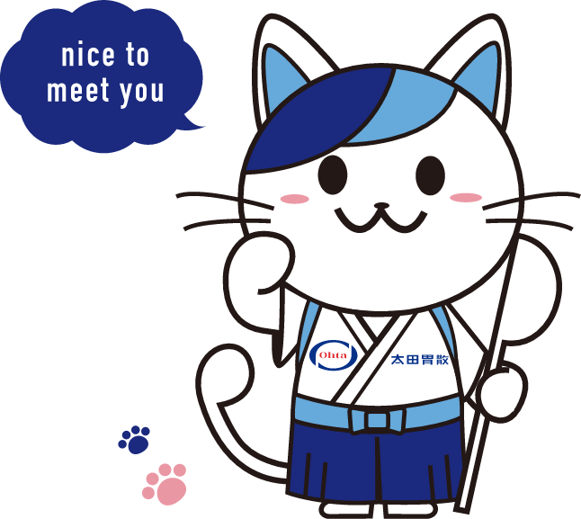
Ota-i-nyan (Ota Isan). Source: https://global.ohta-isan.co.jp/
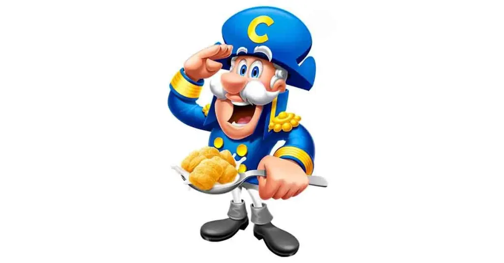
Cap’n Crunch Source: comicbook.com
Blue is a color that evokes intelligence and sincerity. As a symbol of security and peace of mind, it is a popular choice for industries where reliability is non-negotiable, such as finance, IT, and infrastructure. Much like in sentai teams, when roles are assigned by color, blue is typically reserved for the rational and cool character type.
| Manufacturing | Ma-bo (Yanmar)Pichon-kun (Daikin Industries)Una Kowa Family (Kowa / Una Kowa)Ota-i-nyan (Ota Isan)Tanamin (Mitsubishi Tanabe Pharma)Monsieur Kumao (S.T. Corporation / Mushuda)Satoko-chan (Sato Pharmaceutical) |
| Retail & Distribution | Donpen (Don Quijote)Akiko-chan (Lawson) |
| Finance & Insurance | Aomaru (Mizuho Bank)Kabubu (Monex, Inc.)Hamapen (Bank of Yokohama)MA★PY (Nihon M&A Center Holdings) |
| Service & Infrastructure | Paccho (Tokyo Gas)Macapuu (Tohoku Electric Power)Iko-chan (JR West / ICOCA)Daito-kun (Daito Trust Construction) |
| Software & Communications (IT) | The Twitter Bird (X [formerly Twitter])Moby Dock (Docker)Hakousa (learningBOX)Cryteckun (Crytec)Merge-kun (Merge System)Reppen (Repseed) |
| Government | Tax-Taku-chan (Tokyo Metropolitan Bureau of Taxation) |
Blue is frequently used in scenarios where a brand wants to utilize a character without compromising its sense of credibility or formality. For companies whose corporate color is already blue, it’s an easy transition to a mascot. Additionally, adding orange or yellow as sub-colors can help inject a sense of approachability into the design.
Yellow & Orange: Memorable and Eye-Catching
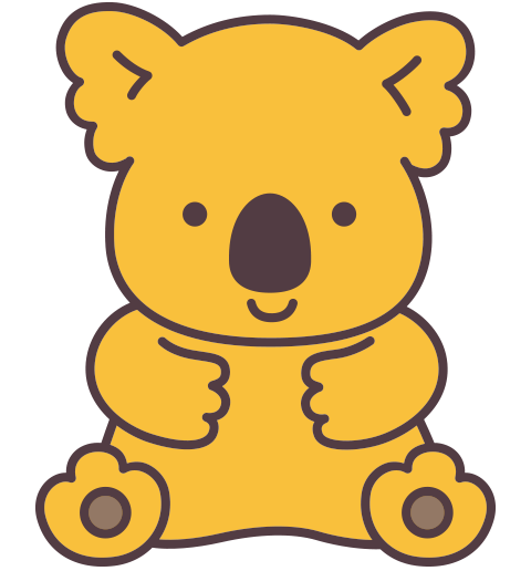
Koala no March-kun (Lotte). Source: https://koalasmarch.com/
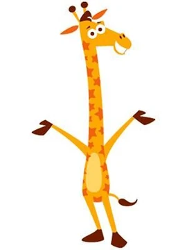
Geoffrey the Giraffe (Toys R’ Us) Source: https://mascots.fandom.com/wiki/Geoffrey_the_Giraffe
Yellow and orange are colors that evoke brightness and fun. Due to their high visibility, they also serve as a way to grab attention, giving them a dual nature. While they are great for creating an approachable, pop impression, maintaining a careful color balance is key to ensuring the design doesn’t look cheap.
| Manufacturing | Hiyoko-chan (Nissin Foods / Chicken Ramen)Koala no March-kun (Lotte)Toshiba-ken (Toshiba)Pon de Lion (Mister Donut)Sato-chan (Sato Pharmaceutical) |
| Retail & Distribution | Ponta (Lawson)Nanaco the Giraffe (Seven & i / nanaco) |
| Finance & Insurance | Himarin (Chiba Bank)Sakkun (Hanasaku Life Insurance)Hyoka-ken (Nihon M&A Center Holdings) |
| Service & Infrastructure | Jetta (Jetstar)Homes-kun (LIFULL HOME’S)Izumin (Tokyo Gas Izumi Energy) |
| Software & Communications (IT) | Poinko Brothers (NTT Docomo / d Point)Wapuu (WordPress)Foxke (Firefox)Nyaruta (ALTA Co., Ltd.) |
| Government & Public Sector | mabari Bary-san (Imabari City, Ehime)Hokuto-kun (Hokkaido Prefectural Police)Funashi |
These colors are ideal for events, sales campaigns, or any situation where you want to build awareness. Their high visibility makes them particularly effective for social media and in-store displays. If you want to maintain a sense of brand prestige while using these tones, pairing them with sub-colors like navy or dark brown can provide a more grounded, sophisticated look.
Green: Peace, Harmony, and Neutrality
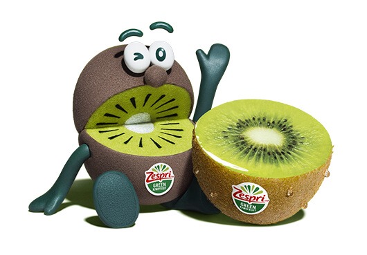
Kiwi Brothers Green (Zespri International). Source: https://www.zespri.com/en-SG/zespri-brothers
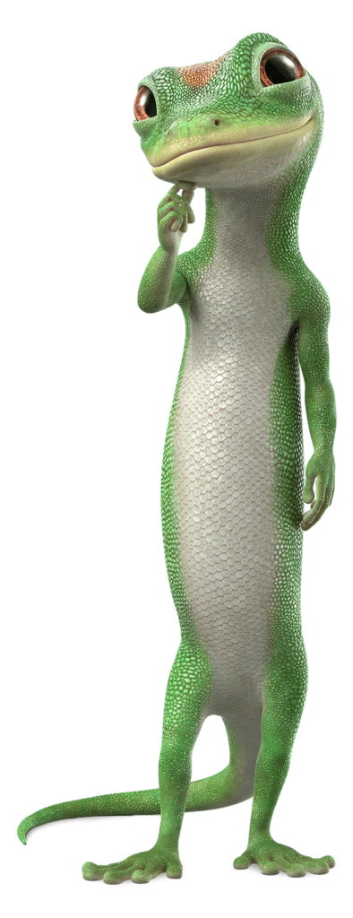
Geico Gecko (Geico Insurance) Source: https://mascots.fandom.com/wiki/The_GEICO_Gecko
Green is a color that evokes associations with the environment, peace, and healing. While it can be more challenging to project a strong personality with green compared to other colors, green characters tend to have a long lifespan and easily build a connection with local communities and the public sector. Since balancing green can be tricky, the design of sub-colors requires a bit of extra thought.
| Manufacturing | Kiwi Brothers Green (Zespri International)Scoppy (Sumitomo Pharma)Kero-chan & Coro-chan (Kowa) |
| Retail & Distribution | Famippe (FamilyMart) |
| Finance & Insurance | Midousuke (Sumitomo Mitsui Banking Corporation)Resonya (Resona Group)Vivasuke (Sumitomo Mitsui Card)Hanna (Hanasaku Life Insurance) |
| Service & Infrastructure | SUUMO (SUUMO)Care-tan (Infroneer Holdings)Hyokkori-chan (Hashimoto-gumi) |
| Software & Communications (IT) | Bugdroid / “Android-kun” (Android)Abema-kun (AbemaTV)My Pyon (mineo)Qiitan (Qiita) |
| Government & Public Sector | Fukka-chan (Fukaya City, Saitama)Yokohama Midori-up Happy (Yokohama City, Kanagawa)Kapal (Shiki City Culture and Sports Promotion Corp.)Marimokkori (Hokkaido)Morizo & Kiccoro (Expo 2005 Aichi)Minkuru (Toei Transportation) |
For brands looking to appeal to themes of the environment, health, or community involvement, green is the first color you should consider. It is well-suited for long-term characters that prioritize approachability over flashiness. Using white or light beige as sub-colors can also enhance a sense of cleanliness and freshness.
Purple: Nobility and Intrigue

Glitch (Twitch). Source: https://fictionalcrossover.fandom.com/wiki/Glitch_(Mascot)
Purple is a unique color that carries conflicting psychological effects, ranging from nobility and mystery, to unease or the supernatural. As a blend of passionate red and calm blue, it can effectively project a sense of premium status or a distinct, otherworldly presence.
That said, purple characters are extremely rare. It is a notoriously difficult color to use as a primary theme for a mascot.
| Manufacturing | Buruburu-kun (Wakasa Seikatsu) |
| Retail & Distribution | Purple-kun (Murasaki Sports)Tanepen Purple (Macnica Group) |
| Finance & Insurance | Neo-chanzu (Neo First Life Insurance) |
| Software & Communications (IT) | Glitch (Twitch) |
| Education & Government | Meijiro (Meiji University)Aikyo-kun (Aichi University of Education)Love Kamishiba (Moriya Company Co., Ltd. / Furano City, Hokkaido)Omura Sakiko (Fuchu City, Hiroshima) |
Purple might be the right choice when you want to differentiate your brand clearly from competitors or evoke a sense of exclusivity and originality. However, as the lack of existing examples suggests, it can be tricky to handle. Without a strong underlying story to explain the color selection, you may find it difficult for the character’s identity to truly stick with your audience.
Neutrals (White, Black, Gray): Symbolism and Brand Icons
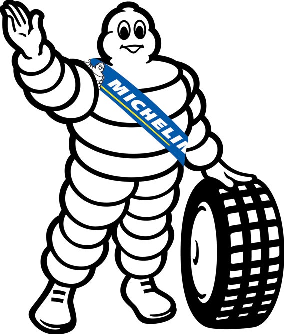
Michelin Man (Michelin). Source: https://www.creativereview.co.uk/michelin-man-logo/
White, black, and gray are achromatic colors that are inorganic and highly abstract. They represent a blank slate quality, making it easy to imbue a character with its own unique story. One of their key strengths is versatility: they can easily adapt to seasonal changes or special events, and their atmosphere can be shifted entirely just by changing an accent color, making them very easy to work with during collaborations.
| Manufacturing | The Michelin Man (Michelin)Todokuro-chan (Nobel / Nodokuro-ame) |
| Retail & Distribution | Okaimono Panda (Rakuten)Okaimono Kuma (Sogo & Seibu)Happy Waon (Aeon)Hatson (Ito-Yokado) |
| Finance & Insurance | Anshin Seemee (Tokio Marine Nichido Anshin Life)Toushi-kun (Japan Securities Dealers Association) |
| Service & Infrastructure | Norurun (Tokyu Railways)Starflyer-man (Starflyer)Bear Do (AIRDO)Keisei Panda (Keisei Electric Railway) |
| Software & Communications (IT) | Tux (Linux)Octocat (GitHub)Kensaku & Enjin (Yahoo! JAPAN)Otousan-kun (SoftBank) |
| Government & Public Sector | Kumamon (Kumamoto Prefecture)Hikonyan (Hikone City, Shiga)Maina-chan (Digital Agency)Kemuimon (Ministry of Health, Labour and Welfare) |
Neutral colors are ideal for brands looking to nurture a character as a long-term IP with an eye toward merchandise and collaborations. Because these colors work well with any background or material, they offer the significant advantage of being highly versatile across a wide variety of media and applications.
Do Preferred Colors Differ Between B2B and B2C?
In categorizing these corporate and regional mascots, a clear pattern emerges: the distance from the target audience and the specific type of trust required by a brand, whether B2B or B2C, directly influences color choice.
When looking at B2B characters, blue (Mizuho Bank, Monex, Docker) and green (SMBC, Resona, Macnica) are prominently featured. From a color psychology perspective, this is a strategic move to guarantee the impressions of intelligence, sincerity, and stability that are prioritized in a professional business context.
In contrast, B2C brands lean heavily toward warm tones like red (Peko-chan, Co-suke) or yellow and orange (Ponta, Poinko Brothers). These colors are effective at stimulating purchasing intent and staying memorable to the general public.
Interestingly, we’ve seen a rise in neutrals like white, black, and gray (Okaimono Panda, Happy Waon, Otousan-kun) within B2C services in recent years. For large platforms handling a diverse range of products, this is a sophisticated strategy that allows the character to remain colorless enough to avoid clashing with various sub-brands while maintaining a sense of sophistication and accessibility.
Key Takeaways by Business Model
- B2B Concentration in Blue and Green
Characters in IT, infrastructure, and finance are densely clustered here. In these sectors, the “correct” industry answer is clearly defined.
- B2C Diversity in Red and Yellow
Used across everything from food to retail and even regional finance, these colors prioritize visual salience; essentially, how easy it is for a customer to spot the brand.
- The Strategic Use of Neutrals
From E-commerce (Rakuten) and transportation (Tokyu, Starflyer) to government (Digital Agency), neutrals are used in B2C to avoid pushing a single image too hard, aiming instead for a refined presence that blends into daily life.
Lately, we are seeing more brands break these norms. Some B2B companies are adopting yellow to project friendliness (like Nihon M&A Center’s Hyoka-ken), while some B2C brands choose neutrals to evoke a premium feel. Beyond just looking at target demographics, a great tactic is to work backward from the question: “In what state of mind do I want the user to be when they interact with our service?”
Do Preferred Colors Vary by Industry?
Across different industries (and in some cases, even beyond those boundaries), we can observe more common color charts that serve as industry benchmarks.
- Finance, Securities, and Infrastructure
Blue and green are overwhelmingly dominant (seen in various banks, Tokyo Gas, JR, etc.). In industries where stability is everything and errors are not an option, these cool and intermediate tones provide users with a vital sense of security. - Food and Beverage
Red and yellow take center stage (Fujiya, Nissin, Mister Donut, etc.). These colors appeal directly to the human instinct of appetite and evoke images of a cheerful, energetic dining table. - IT and Tech
Blue, purple, and neutrals stand out (Docker, GitHub, Twitch, etc.). These palettes symbolize innovation and creativity, utilizing colors that resonate with an intellectual user base. - Public Sector, Local Government, and Infrastructure
While red (for passion or awareness) and green (for harmony) are used, this sector is unique for its variety. To express regional identity or organizational heritage, you’ll often see purple (Meiji University, etc.) or even multicolored schemes (various yuru-chara mascots). Compared to the private sector, almost any color can be found here.
It is worth noting that an industry’s “standard” color is also, by definition, the color where the competition is fiercest. As seen in our examples, while the banking industry is a sea of blue and green, Tomato Bank (Tokkun) and Chugoku Bank (Momochu) utilize reds. This choice alone provides powerful differentiation and makes them much easier for customers to remember.
Whether you follow the rules or break them, such as ignoring industry standards because your company name or logo is based on a specific noun, the first step of any character strategy is deciding exactly what impression you want to leave behind.
Defining Character Presence Through Complementary Colors
In color psychology, the color combination is just as important as the effect of a single hue. In particular, understanding complementary colors – those positioned directly opposite each other on the color wheel – is essential for making a character pop against a background and capturing the user’s gaze.
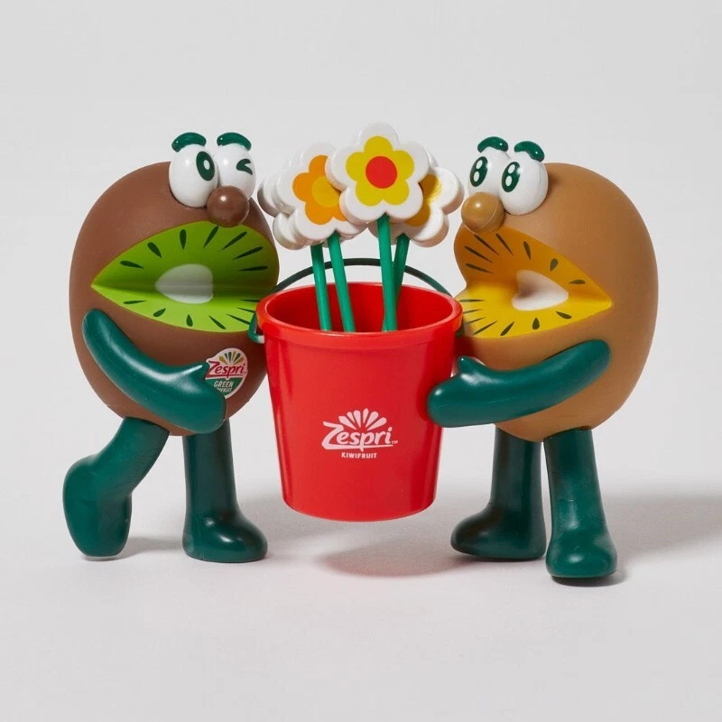
Zespri Brothers Kiwi (Zespri International). Source: https://www.zespri.com/en-SG/zespri-brothers
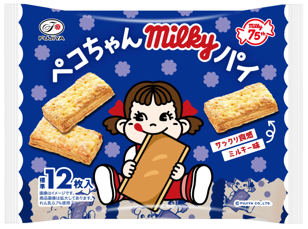
Peko Chan Fujiya. Source: https://fujiyausa.com/pages/our-characters
Take Zespri International’s Kiwi Brothers (Green), for example. When the calm green of the body is paired with red tones in their buckets or promotional materials, the two colors enhance one another, creating a very high-impact visual. Similarly, the red of Fujiya’s Peko-chan set against the blue or green tones often used in her outfits or backgrounds is a classic technique for heightening a character’s presence.
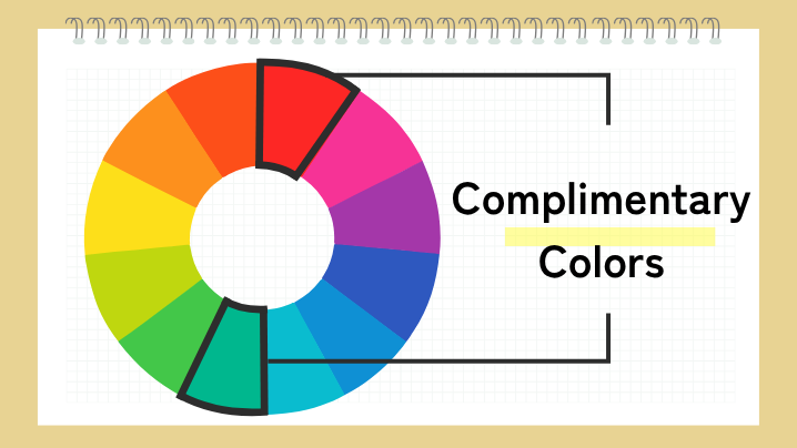
When used correctly, complementary colors bring out a sense of stardom in a design. However, if the balance is off, the contrast can become jarring and cause visual fatigue for the viewer. The key to creating a character that remains pleasant to look at over the long term is subtraction: keeping the main color at about 70% and limiting the complementary accent to 10–20%.
Practical Tips for Applying Color Psychology to Character Design
We’ve explored color trends through various case studies, but it’s important not to let this knowledge remain purely theoretical. Here are three practical points to keep in mind when integrating color psychology into your character design.
1. Define Your Purpose and Target Audience First, Then Work Backward
Choosing a character’s color begins with putting two things into words: “Who is this for?” (Target) and “What emotion should they feel?” (Purpose).
For example, if you want to deliver sincerity and peace of mind, like Mitsui Sumitomo Bank’s Midousuke, green is the way to go. If you want to convey excitement or intensity, like Tohato’s Boukun Habanero, red is your best bet.
That said, in most cases, you’ll likely want to use your existing corporate color as the primary palette. This is where the selection of sub-colors becomes vital. Even if your corporate color is a reliable blue, you can introduce a warm orange through the character’s accessories or clothing. This allows you to project friendliness while maintaining that core sense of integrity.
2. Don’t Add Colors Later: Limit Them from the Start
One of the most important pitfalls to avoid is adding more colors once the design has already taken shape. As you increase the number of colors, the psychological message the character sends becomes diluted, often resulting in a design where the core intent is lost.
To maintain a consistent brand image, it is crucial to limit your palette during the initial concept phase. Even if a user doesn’t remember the character’s name, being recognized as “that blue character” or “the one in the red outfit” creates a powerful visual identity. Adding colors later usually disrupts the overall harmony and leads to design drift. While restricting your palette might feel like it’s narrowing your creative range, sticking to your primary colors is what ultimately preserves the integrity of your brand’s world.
3. Rarer Colors Aren’t Always an Automatic Opportunity
In an effort to stand out, it’s tempting to look toward colors with low usage rates. As we mentioned, because there are so few corporate characters using purple or black, adopting them can certainly give you a visual edge.
However, a rare color isn’t always a golden opportunity (pun intended). For instance, in the medical or hygiene sectors, where cleanliness is paramount, choosing a murky or dull color as your primary theme is a risk rather than a smart differentiation. If you want to stand out in an industry saturated with standard colors, a lower-risk approach is to adjust the brightness or saturation of a color to create a unique tone, rather than switching colors entirely.
Furthermore, succeeding with a minority color requires a strong narrative that explains “why this color?” Tomato Bank (Tokkun) is a great example: using red in the finance industry is unusual, but because it is tied consistently to the company name and the tomato motif, that un-industry-like color becomes a powerful asset rather than a distraction.
Conclusion
In character production, color psychology is a core strategy for delivering your brand’s message. By understanding the psychological effects of color and making evidence-based color choices that consider your target audience, industry characteristics, and corporate identity, your character can become a powerful asset for your business.
Remember, the journey doesn’t end once the character is created. A mascot is an evolving entity that builds a fanbase through every touchpoint, from social media and videos to your official website. We encourage you to use the insights from this article to rethink how you can leverage color to make your character truly shine.
Contact G-angle for Your Character Design Needs
At G-angle, we provide character design services backed by an extensive track record of over 3,500 projects annually and more than 20 years of expertise in the entertainment and gaming industries.
We do more than just create good-looking characters for the Japanese and global markets: we offer comprehensive proposals that consider overall color balance, your corporate brand’s tone and manner, and strategic positioning against your competitors. From initial design to subsequent video production, merchandise development, and PR activities, we provide end-to-end support for your project.We are here to partner with you to give your company’s vision a tangible form through the perfect character.